15 years ago, my whole desktop environment was dark. Dark terminal, dark vim, dark graphic environment, and dark mp3 player. It was pretty cool. I felt like a hacker in those unrealistic 90s movies. Whoever stepped into my room would think that I was doing some rocket science. In fact, I was probaby just listening to mp3, learning some bash scripting and taking screenshots to share my cool desktop in online forums. I can’t say it wasn’t fun, though.
10 years later I started noticing how hard it had become to read/write code in my dark environment. My eyes would feel sore and it was hard to focus on the code. Fonts were blurrier in my shiny retina display than they were in the 640x480 CRT monitors I used back in the days.
After a bit of research, I found out that it probably happened because of my astigmatism. There are several scientific studies that show that people with astigmatism have trouble reading on light-on-dark schemes. I found out about them in this SE answer. People with astigmatism experience the so-called halation effect:
The spreading of light beyond its proper boundaries to form a fog around the edges of a bright image in a photograph or on a television screen.
Check out this blog post to see how it feels.
How I fixed the issue
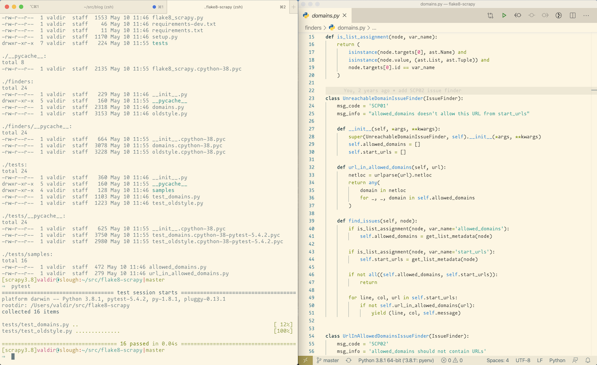
To avoid this issue, all I did was changing my whole desktop to use a light background for everything. Solarized Light is my favorite color scheme for my editor, terminal, and many other apps. This is how my development environment looks like these days:

Not as cool as my screen two decades ago, but fully functional. 😉
Dark backgrounds are everywhere
Every week I see someone celebrating the fact that yet another app now supports dark backgrounds. The products announce it as if they had found the cure for cancer. It’s kind of weird to see how far they go to announce a (wait for it…) new color scheme. Apple focused a MacOS release on something that most Linux graphical environments allowed me to do 20 years ago.
I am not preaching against dark backgrounds and in favor of light ones. In fact, most people that I know can’t code in a light environment for too much time as they suffer from eye strain after a few hours.
From a reader perspective, though, there are multiple studies showing that it’s harder to read in light-on-dark than in dark-on-light.
It gets worse at conferences
I’ve been in countless conferences where the speaker used a dark background to present snippets of code. Me during their talks:

And it wasn’t just me. You could see people squeezing their eyes all around the room. Sometimes even the speaker notices and apologizes (or blames the video projector).
Even in a world where everyone can read well in dark backgrounds, there are still crappy devices and bad lighting to ruin your talk. It’s not really common to find a conference with the right combination of light and good projection devices. It’s probably hard and expensive to do so (I have no idea, to be honest).
But what can you, as a speaker, do? Use light backgrounds for your slide decks and specially for the code snippets. That will give you and your audience a better experience. As a bonus you also reduce the chances of having your talk negatively impacted by an external factor like this.
This is all about me, though
This blog post talks about my personal experience using dark vs light backgrounds. I am no doctor and I know nothing about the human eye to give any sort of advice.
Anyway, I feel it’s worth sharing what worked for me as there may be other people having similar issues and a light background could be worth a quick try. In any case, a doctor is probably the right call. 😀
Disclaimer: the snippets on this website will continue to use a dark background, just because it looks cooler. 😂